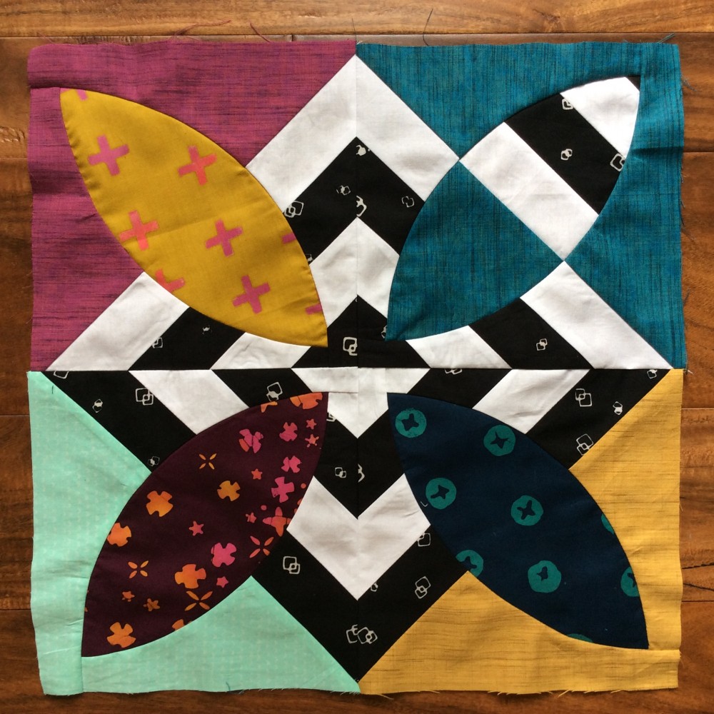
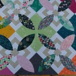
I have been working on a second version of the Summer Bloom quilt. This time I am going super high contrast and bright colors. It seemed like the perfect opportunity to use my stash of Alison Glass Handcrafted batiks (Andover Fabrics). I have had them in a bin along with a collection of cross weave and shot cottons…I think they pair wonderfully: the texture and color of the cross weaves is a perfect match to the batiks.
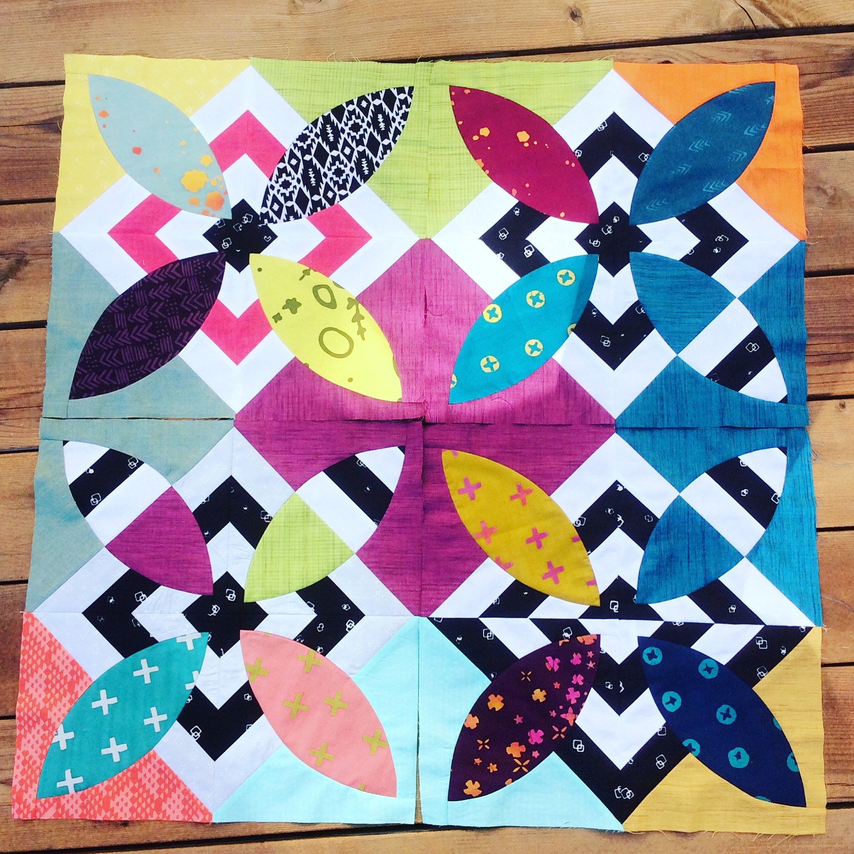
I started out planning on doing all the striped segments with black and white. I am using a black batik from the Me + You collection from Hoffman fabrics. I love how it looks with the bright white and colors. But after I made a couple of blocks, I decided to experiment a bit…trying different combinations in the stripes…so I have mixed a few other colors here and there, or swapped the position of the black and white.
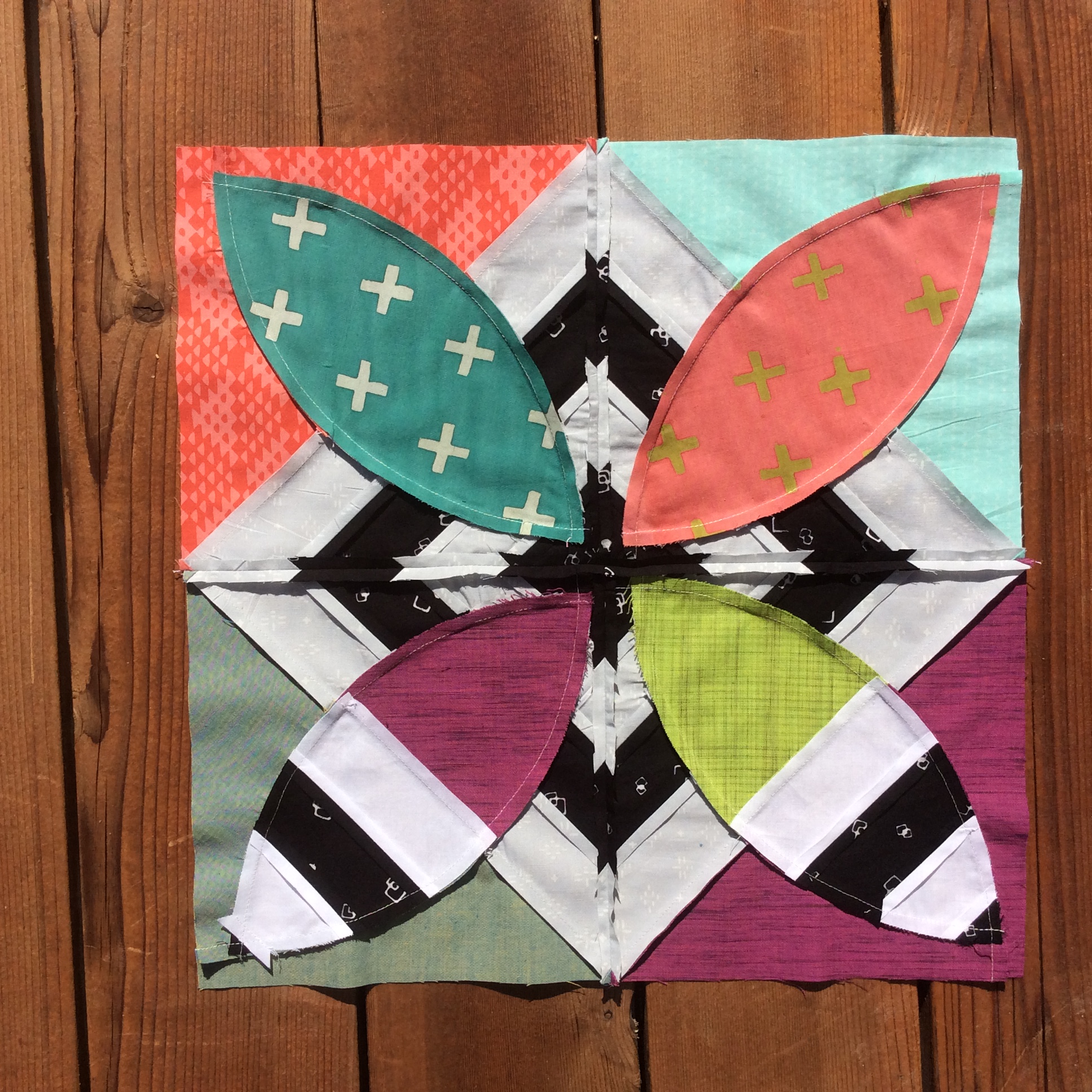
So, while this version has taken more planning than the original all black and white plan, I am loving how it looks. It is also challenging my ability to plan and visualize a very chaotic graphic design and make it look good. I haven’t drawn it out, so I’m to positive it will look good in the end…or if it will just look crazy…we shall see!
I have several segments finished and I love it so far! It is fun to see how different a pattern looks in a new color story.
-Sharon


I really like the way you have changed up your original, punching it up with strong
graphics and bright colors. Very fun!
Wow! So colorful and bright…I love them!
Really enjoy the boldness. Just heard about you on Pat’s podcast