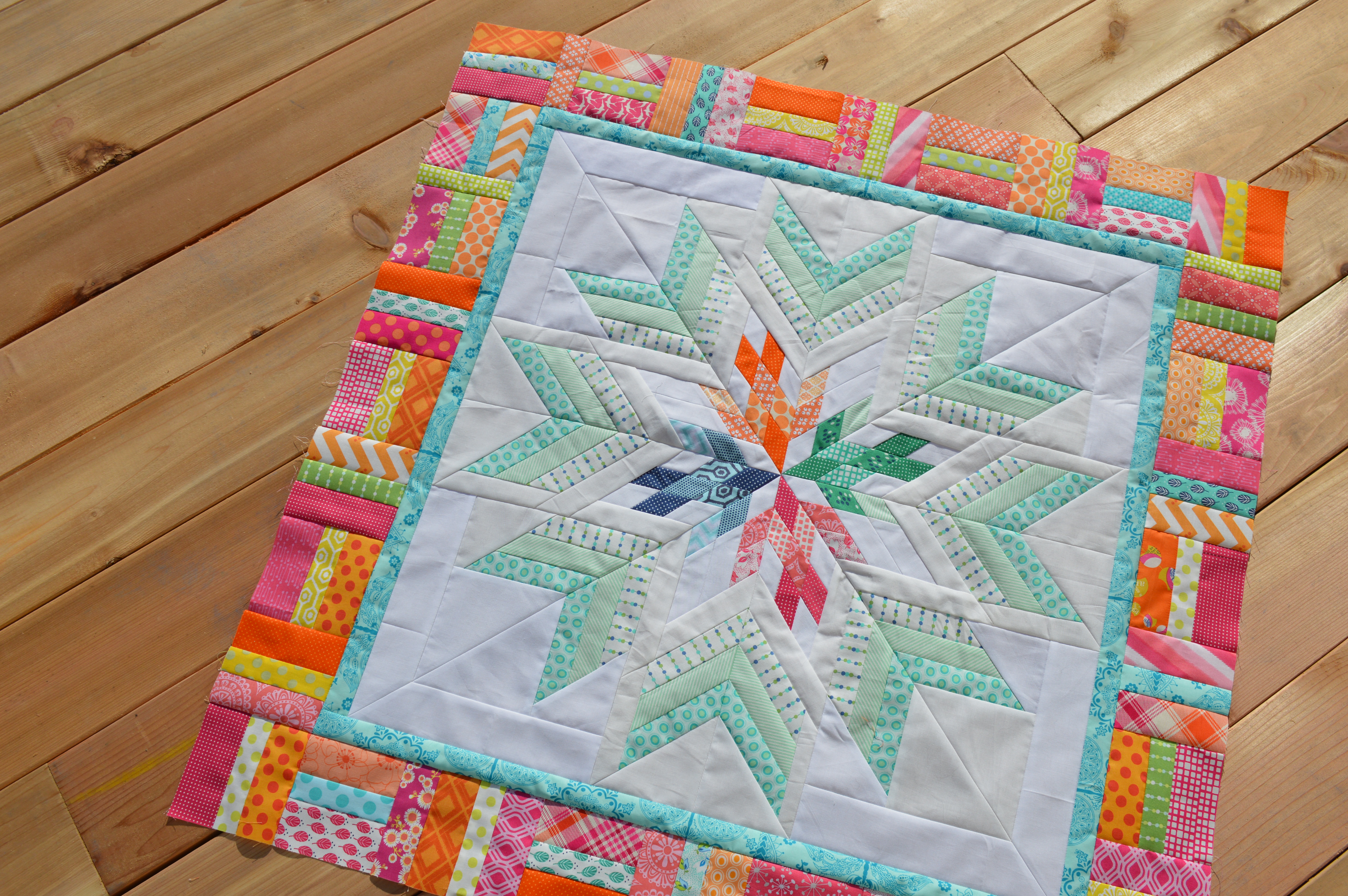
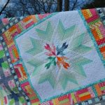
It was fun last week to get back to my Aviatrix Medallion and add the first border. If you are familiar with the pattern, you can tell I have altered mine a bit to fit my taste. I made the center star larger, so I skipped the actual first border, which is half-square triangles.
Since I have lots of greenish blue in my center star, I decided to turn up the heat in the first border by using mostly hot pink and orange strips. I like how the bits of yellow, green and blue pop amidst the brightness and pull from the colors in the center medallion.
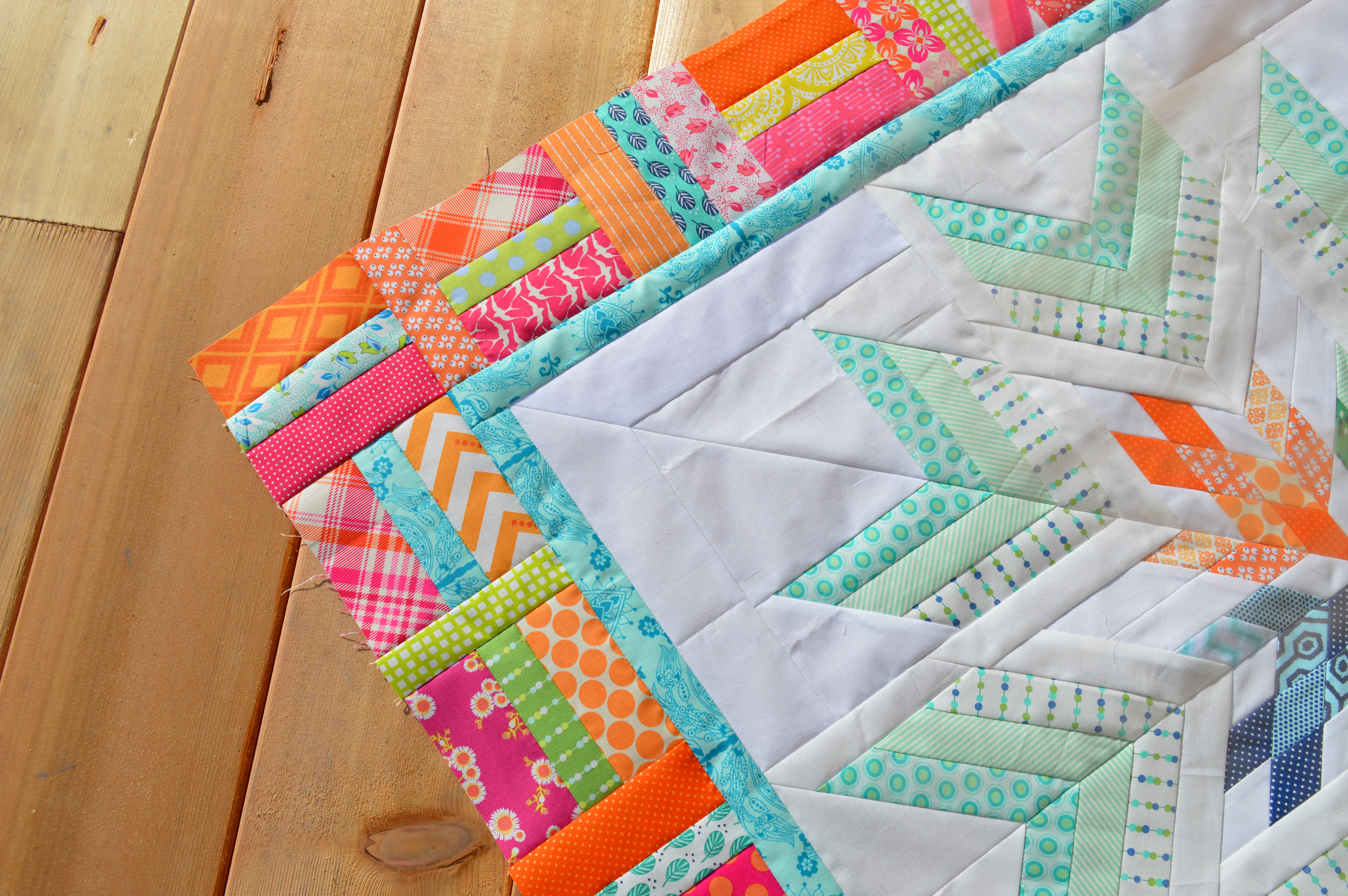
I debated a bit about what color to make the first stop border, or whether to even have one. It turned out that adding the 1″ blue border helped me with getting measurements where I needed them, so that made my decision. I ended up choosing this turquoise blue print from an oldish Pat Bravo collection that I had in my stash. I love the vibrancy of the color and it is just the right bit different from the green/aqua strips used in my star, which I like.
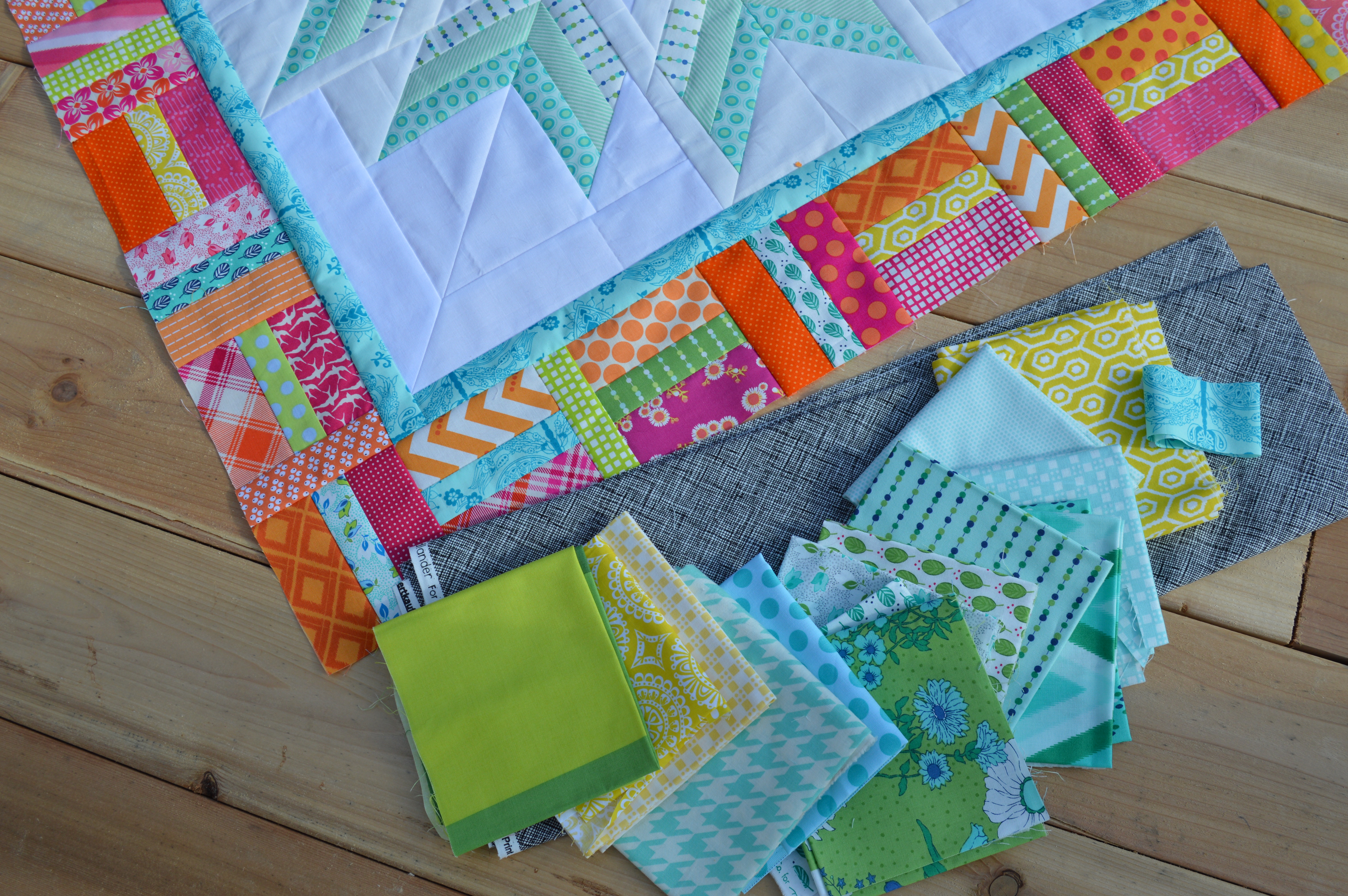
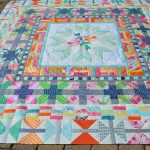
I started thinking about the next border and choosing a few fabrics. I keep coming back to this blue, aqua, green-yellow combo. I am considering mixing in some of the black, too. Any thoughts?
This is a really fun quilt to make and I am enjoying picking out the colors and prints. I feel happy to be using some stash fabric favorites! We will see how it comes along…it’s fun to see how a project like this evolves as it grows. It’s also fun to mix in some of my own ideas and tinker with the scale.
Happy Wednesday!
Sharon
The Aviatrix pattern is by Elizabeth Hartman. My sponsor, Canton Village Quilt Works,
has it for sale online, click Here


This is beautiful! I love the pop of the border! Can’t wait to see more.
You did it again. Your quilt is so beautiful. I love it and now I’ve ordered the pattern. Hugs
I like how the bright border brings out those fabrics in the center of the medallion. I think you can definitely incorporate the black into the next border like Elizabeth used the gray in hers at the tips of the “pluses”, or even as a dark contrasting background… it will be fun to see what you decide!
Love it so far. I like the next colors and would definitely put some black in there.
I need to locate and add my last border, then just quilt it!!
Really like the contrast with the soft greens and the vibrant outer border. Look forward to seeing this grow!
I like the expanded star and the alternating bright/cool/bright so far. My first instinct is “no” to the black, but so much depends on how much and how you would use it, that I am not saying that very loudly.
Love this! I think that soft black would look really nice, too.
Gorgeous! I love your bright colors. I can’t wait to see it finished.
I love your fabric choices! Can’t wait to follow along with this quilt!